Showing posts with label 4x4. Show all posts

Monday, July 7, 2008

the last chunky page!

i took some TTV portraits today that turned out kinda neat, especially after i edited them a bit in photoshop to adjust the contrast (red polka dot dress? VERY cool in high contrast!!) however, i don't have permission to post them publicly, so i won't post them here unless they say i can. (hint! yes or no?)

in other news, my last chunky 4x4 page was received today!

this one was quite a departure for me as well, so bright!
Photobucket
Photobucket
the background was painted pink, and then i did a medium transfer with a punjabi newspaper and rubbed off a bunch of it before overpainting with a watered down orange acrylic. the henna hands are an image from the dover sampler, but i made them pink in photoshop, and then did an image transfer (like a packing tape transfer, but with actual transfer material). the image, the postage stamp, the bindis, bits of gold foil and the scrap of sari/saree fabric are all pretty self explanatory! the writing says "art" in hindu. i went to my favourite independent fabric store, it's run by a family that's been in business for over 20 years, and asked them to write out the word "art" in punjabi and hindu. i used the hindu one since the background is a punjabi newspaper. i think the writing on the stamp is hindu as well, since that's the national language of India.

Photobucket
the fibers, with printable shrink art images of the henna hands, an elephant and ganesh. more saree/sari scraps, and lots of colourful fibers.

Photobucket
the back. i found this paper at ruby dogs on the last day, it's GORGEOUS! super delicate, with the image of ganesh and the gold foil. and i added a scrap from a salwar kameez with beading on it. ganesha is known as the "patron of arts and sciences", which makes him even more appropriate for the page.

it's kinda different, but i had fun with all the bright colours. i usually try to stay away from really specific cultures in artwork, because it makes me uncomfortable (ie, all the geisha images you see, japanese or chinese art, etc), but i hope this was respectful enough.

Monday, June 16, 2008

more chunky pages!

i've been so impatient for these to arrive, because i was so excited about posting them here!

they were both made using the silicone transfer technique that i was talking about the other day, and damn, it's slick!

these pages were for rackycoo, who's just too bloody amazing for her own good, and i got all stressed out and had to send her two, i just couldn't make up my mind!

the first page is the red winged blackbird page, titled mother nature's art (i tried to put the word "art" on all the pages i did for this swap)
Photobucket
i painted the background a strong orangey red, and then used the silicone transfer technique to transfer the red winged blackbird. i added black and gold ink around the edges, and then decided it needed a bit more, so i used crackle medium over the ink. i added the cigar bands just because they're cool, and i wanted a bit more gold in it.

Photobucket
the back is very simple, a piece of joss paper with this stamp from invokearts.com.

Photobucket
the fibers were fun - the charms are all shrink art stamped with staZon ink using the stamp from the back and stamps from this set at invokearts. the lettering comes from this set.

and the second page was a circus themed page, titled "the art of childhood"

Photobucket
the base is mat board, and i did a silicone transfer using an actual bingo sheet instead of a reversed photocopy, so the numbers are all backwards, which just adds to it in my opinion! i think next time i'll paint the matboard, because it needs a bit more protection from the water than just the silicone. after the transfer had dried, i lightly painted it all yellow, and rubber stamped it with a cheapy stamp i'd bought micheals for $1.50 using purple pigment ink. it used to say PARTY down the side, which i hated, but i loved the diamond design, so i carefully cut the party part off (not that careflly - i stabbed myself while doing it!). i embossed the diamonds to adda bit more depth, and used green pigment ink to create a bordre around th eedge of the vintage playing card. i embossed that as well, mostly because the pigment ink didn't want to dry on the gloss of the card. i added the orange ticket and th red bingo chips, and a piece of a tim holtz distressables card, which i sanded lightly and edged in blue pigment ink. the bing chips have the letters A R T stamped on them using staZon ultramarine, which basically looks black!

Photobucket
the back was again very simple. a piece of patterned paper, brushed over with orange pigment ink to make the colours brighter and deeper, and the title with my name and stuff. the word art on this one is a stamp from alphastamps.

but the fibers! ooh, the fibers. i went a little overboard! as racky put it, the fibers are a circus all on their own!
Photobucket
polka dot and stripey ribbons, bright variegated wool and left over dyed green twill tape from an earlier tip in page, all strung with brightly coloured pony beads, bingo chips, a little strawberry button, a plastic hamburger, a bow, a few plastic flower beads, a little plastic scottie dog and at the vey end, a bell, same as on the jester's hat.

the silicone transfer technique is very cool, it came from the Collage Discovery Workshop by Claudine Hellmuth. i had to special order the silicone from a hardware store in the US, because we don't have the elmer's brand that's brushable up here. i'm really loving it.


i also sent her a copy of tim holtz distressables, which i picked up at a spring sale at clipper street in langley and never got around to sending her. i got a copy for myself as well, and it's quite a cool book. thought it's obviously all about using his supplies, it's got some awesome ideas in it as well.


and in other exciting news, i won a giveaway today! cynthia at big girl feet had a draw for her blogaversary, and i won! she's been doing her blog for 3 years now, which is awesome. i've only been blogging since september 12th 2007! i actually first saw cynthia's work about 8 years ago, when we were both selling at the same local store, and i fell in love with it then. i realized that she was on craftster, and found her blog that way. i managed to get a couple of her pieces a few years ago when she was doing a studio clean up sale, and they're both hanging in my studio now.

Thursday, June 12, 2008

ancestor piece and chunky page

more stuff to post!

a few more pieces that i've made have been received, so i can post them now.

first, another altered ancestor piece.
Photobucket
the recipient didn't know who these people actually are, she just found the pic with her family photos, so i used the friend stamp. she said she liked blue and brown, so i did that, and i was a bit worried it was too similar to the other piece i made, but it's different shades.

the background is the peeling paper technique from the claudine hellmuth book i bought a few weeks ago, using music. i saturated it with blue walnut ink, and then blotted it to get an even colour. it took FOREVER to dry! once it was dry i stamped it with staZon, the two brown shades, using a stamp set from joanns. i made the pic more brown before printing it, and then edged it with the dark brown staZon to create a "frame".

and a chunky 4x4 page
Photobucket
the background is strips of text attached with acrylic medium that was mixed with blue and white paint. the typewriter stamp is from alpha stamps (love!) and is stamped with staZon ultramarine (also LOVE!)

Photobucket
pop up! well, kinda. more like "pull tab"!

Photobucket
very cool stamp from alpha stamps, again stamped with the staZon. background was painted with the leftover medium/paint mixture from the front.

close up of the fibers - full of beads and teensy little shrinky dinks
Photobucket
that staZon ink works fab for shrinky dinks!

i was really happy with these two. this week i've been working on some more pieces using a silicone transfer technique, which is SOOOO damn cool, but all the piece i'm working on are still secret at the moment.

Tuesday, May 27, 2008

chunky 4x4 pages and altered ancestor pieces

here's a chunky page from back in march! it went to australia though, so it took a while to post!

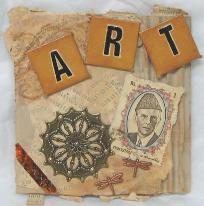
kind of a hodgepodge... i'm not sure what language the background is, but it's something middle eastern... and then i found the stamp from pakistan, and decided they went together. i like the varying colours of the metal, and i did the foil transfer with double sided tape, which i'd never tried before.
Photobucket
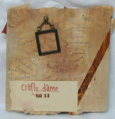
i like this random frame. it's not framing anything, but that's okay!
Photobucket

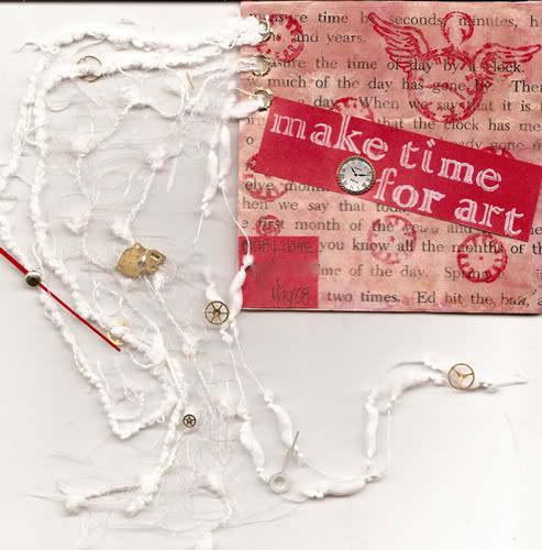
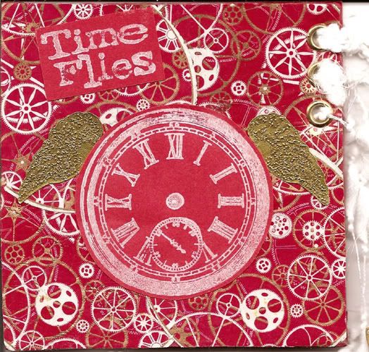
for someone who loves clocks and the imagery of time
Photobucket
Photobucket
i was really stuck on this one, because the recipient had commented on this page i made, and like it, but said she wanted colour... i knew i was going to do the clocks, and i ended up having a ton of ideas, but i couldn't decide which one to use. once i remembered the playing cards i'd bought with the clock gears on them, it all came together!

i tried to do a packing tape transfer with the playing cards, but that failed! it did allow me to scrap off the majority of the card though, so the circles on the front are much thinner than they were originally. and then i tried desperately to make the little embossed gold wings move, but that failed too, and i eventually gave up. i did leave them unglued, so if she's displaying the page on the wall or something where it won't be flattened against other pages, she can bend the wing edges up a little bit.

the backside is paint and ink and clock stamps overlaid with a contact sheet transfer of the "time" entry in a children's dictionary. the little clock came from alphastamps.com - i ordered it for this page, and then forgot all about it until the last minute!

i hope the clock pieces stayed okay in the fibers - they were so tiny, and the fibers were too chunky to really tie them around them, so i glued them on with glossy accents.


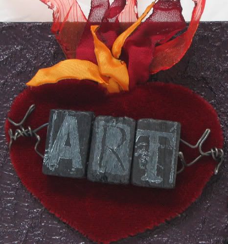
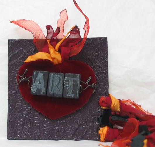
and for someone who appreciates sacred hearts as much as i do!
Photobucket
Photobucket
i'm SOOO in love with that heart! i finished it weeks before i got around to finishing the page, and it sat on my coffee table the whole time. everytime i saw it i had to pick it up and look at it! my family was getting soooo tired of me telling them how much i loved it!

i cut a heart shape out of cardboard, and then wrapped the red velvet around it, sewing across the back to stretch the velvet. the background is paint and this really cool acrylic medium with eensy little glass balls in it, very cool texture. i cut vague flames shapes out of chiffon and lining fabric and singed the edges, causing the fabric to curl into itself and become flame like, and then i tacked the flames onto the back of the heart. i glued the whole thing onto the backdrop with silicone sealant, since my dad has stolen and lost my goop AGAIN.

the word ART is stamped on the backs of asian game tiles of some sort, i liked the organic feel of them, and the fact that they're black. (duh!) i drilled holes in them to thread the wire through. i really love that wire too, it's got very subtle colour changes through it, but i didn't get to use enough for this piece for it to actually show.
Photobucket
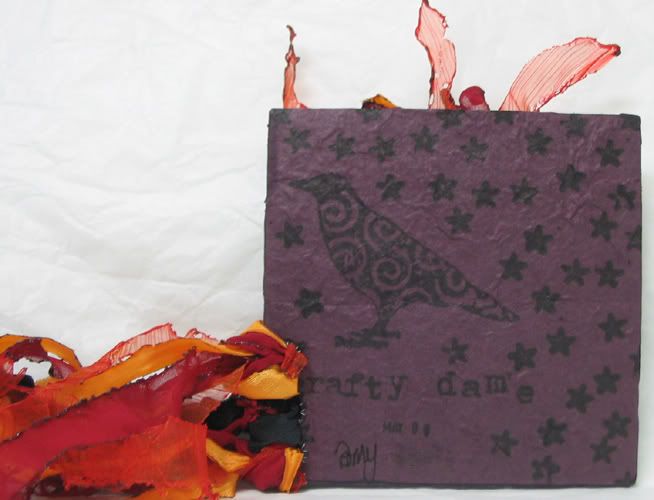
i cut long strips of the flame fabrics and burned them as well, they're the fibers hanging off the side of the page, along with some black velvet rickrack, but you can't see how long they are.


and i've also joined a new swap called altered ancestors. we all e-mailed out photos of our ancestors, along with little bios, and every two weeks we make up a new art piece for someone in the swap. it's really neat, i didn't truly appreciate how difficult it can be to make art using a specific person - you feel as though there's such a need to be accurate! sure, that stamp of the eiffel tower might look cool... but did that person ever leave north america? it's been really fun though, and i'm working in a 6"x6" format, which is a nice change from the 4x4 size of the chunky page swap.

these were the first two pieces i did.

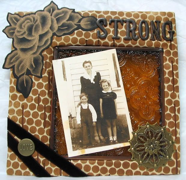
this is the swapper's grandmother, mom and uncle. her grandmother married at 15, and was widowed at 17, when she was 5 months pregnant with the uncle. her husband was 30 when he died of TB. hence the word "strong".
Photobucket
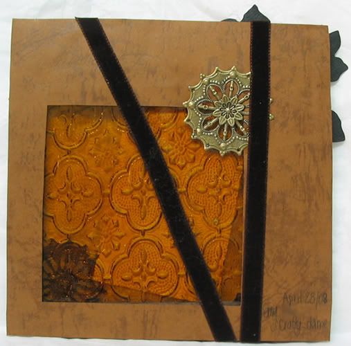
i've been DYING for a project to use one of these glass pieces in! they're exactly 4x4, so they don't work for chunky pages as easily - the edges are kinda sharp, so they need to be surrounded by something. i coated the sharp edges that aren't hidden with glossy accents, that shit works for everything! the base is super thick cardboard, painted dark brown, you can see it peering through the holes. the background is player piano paper, and i stamped it with punchinella and ink, using a make up sponge. that's partly why i'm so excited, i can NEVER get punchinella to work the way i want it to when i use paint, but ink works fabulous!

and the back
Photobucket
very simple. i don't even know if we're supposed to decorate the back or not, but i didn't want to leave it totally bare. the ribbon and the metal thing are positioned to help hold the glass in place. it's not actually glued, just held in by various pieces on the front and back. it's pretty secure.

and the second piece -
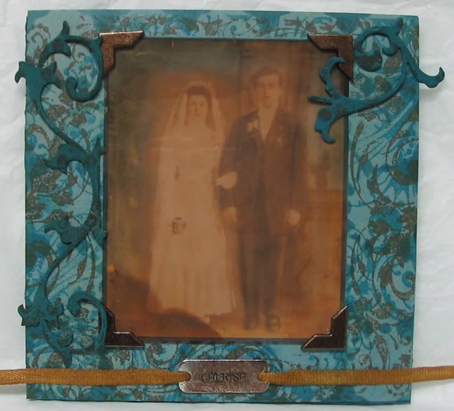
i was all worried that it wouldn't be as cool as the piece above, but i really like it. i LOVE the photo she sent me, it's of her great grandparents on their wedding day. they were polish immigrants, and the picture is about 90 years old. it has water damage on it, but i think that just adds to it!

i was in love with the bits of blue caused by the damage, so i went with a blue and brown page.
Photobucket
the background is a slightly mottled blue, then i stamped it with plastic lace and one of my nick bantok stamp pads. it didn't work as well as i wanted, so i added swirly stamps in another shade of the nick bantok inks, and one of the tim holtz ink pads (old photo, i think). the big swirls are grungeboard, in the polkadot pattern. i painted them the same shade as the edges of the base, matched to the backing paper, and then added ink (tim holtz old photo again). the photo is printed on transparency film, and there's a piece of cream cardstock behind it, and then an oval of white tracing paper between the people and the cardstock, because i didn't want them to be too yellow/creamy. the corners are pewter, stamped with staZon saddle brown, as is the charm at the bottom that says "cherish". the twill tape was stamped with staZon as well, the other shade of brown. i used glossy accents to glue the metal bits down, it works better than regular glue.

i'm working on my next two pieces tonight. i bought the book "collage discover workshop" by claudine hellmuth and i'm trying out some background techniques from it, but everything's taking FOREVER to dry!

Wednesday, April 9, 2008

atcs and a chunky page!!

it seems like the mail is taking FOREVER lately, and i'm so impatient to post things! silly mail.

i've been working on lots of stuff off and on, i have almost 30 vinyl wristlets cut out, appliqued, and ready to be assembled, but they keep getting set aside in favour of higher priority projects.

i made a bunch of ATCs in the past few weeks, and they've all been recieved, so i'll post them. i made two tip in pages, and two chunky 4x4 pages as well, but only one of them has recieved, the others are apparently touring the world via the postal system!

and i also made a few custom orders, which again, are still in transit.

but! i do have atcs to share!

these were for the alphabet atc a,b,c swap i organized on craftster.org (it's just winding up now, and d,e,f will be organized next)

a is for aerial acrobatics, arabic and apple green
Photobucket
Photobucket

b is for burlesque
Photobucket
Photobucket

c is for clocks
Photobucket
Photobucket

they're all quite different, but i really love how they all turned out.

and a chunky page!
Photobucket
Photobucket
Photobucket
the quote says "Your past is not your potential. In any hour you can choose to liberate the future." I stamped it with a water based ink pad (the tim holtz ones from ranger), and it really didn't react well to the acrylic paint and medium mixture that i used to give the page texture before stamping, and everything i stamped lightened quite a bit. i overstamped a few of the images with my staZon ink (the lighter brown - is it saddle?). the little glass things are from watches as well, they curve up from the page. the watch pieces are adhered with glossy accents, which is usually clear, but on this page i very lightly brushed it with water based ink before doing anything, and you can see (especially on the lower left) where the glossy accents picked up some of that colour. the stamps are from an unmounted rubber sheet i bought in portland last month, it's the "time flies" set 8513 made by invoke arts. they were really cheap actually!


DO NOT go to that website if you're on a budget!! i'm practically drooling right now, their stamps are INCREDIBLE! a whole page of religious stamps! frida stamps! dios de los muertes stamps! lace patterned stamps! very cool atc background stamps! very cool crow stamps! i definitely need to save up and order some, i don't think i can resist!

and more atcs! these were for the fabric atc swap i organized (again, still finishing up, stupid mail system!). i ended up in two groups, so i made 6. i was on a vinyl kick, so they're all out of vinyl.

a stylized peacock feather
Photobucket

a russian nesting doll (the designs and the face were stamped on)
Photobucket

a kitschy toaster
Photobucket

kitschy kewpie dolls
Photobucket

the framed crow (again, the frame was stamped on)
Photobucket

and the anchor
Photobucket

as you can see, i've started using glitter vinyl. i LOVE this stuff! i picked up a ton of it in portland when i was down last month, and it's fabulous! it took a bit of experimenting, as my machine wasn't sure of it at first, but after learning that i must adjust both the tension and the stitch length, as well using the walking foot instead of my teflon foot, i'm getting the hang of it!

Thursday, March 27, 2008

numbers and an art bird

i just realized i haven't posted a tip in or chunky page in a while.... i'm working on a few right now, so i won't post them until they're received, but these two have been received already...


Photobucket
Photobucket

(this is the first thing i've made with my new glitter vinyl, FYI!)
i do really like it, though i think i should have gone over "art" with a lighter shade of blue... it's pretty simple, but i'm hoping the novelty of vinyl with make up for that... i really like this vinage vinyl, with shades of blue and green. on the back, i randomly sewed all over it in the blue, just to add a bit more interest.

Photobucket
Photobucket
i did the embroidery when i was in portland, i planned the project before i left, because i wanted something that was more portable than regular papercrafts. i dyed the fabric with coffee, then stamped all over it and embroidered it. the little frames are filled with glossy accent, which makes them look like they're filled with resin (i learned that in my new tim holtz book!).

i still can't decide if i like it or not.... i LOVE the number stamps i used, i desperately want letter stamps in that font... if you've seen them anywhere, TELL me!!!

Saturday, February 23, 2008

chunky 4"x4" pages

and here it is! i LOVE this page. it was so hard to give up, but i knew the reipient would love it too. i'm so proud of it. it was a lot of work (a lot of steps!), but i'd invisioned a page like it since the swap was first mentioned, and i was really excited to have someone to make it for so quickly (early on in the swap)! i'm planning a large piece for my bathroom that's similar.

first, the scans.
Photobucket
the page itself is about 1/4" thick, it's made of two layers of corrugated cardboard and a piece of a ritz box. i cut the niches out of the cardboard layers and glued all the pages together, then used gel medium to coat them in white tissue paper. i wanted the edges to be solid too, so i covered them in the tissue as well. i painted it all white, except for the niche, i painted blue. i really like how the paint reacted to the tissue paper texture, it almost looks rubbed off in places, like a whitewashed wall. i stamped it with blue pigment ink, and printed out "hail mary" repeatedly on acetate and attached it. the mary statue is polyclay, i made a mold out of one of my little statues in my bathroom (using polyclay), then carefully reproduced it. it's only 1/2 as thick as the original statuette, so it fits into the niche nicely. it was white polyclay, then i did a wash with the blue paint. the niche itself is flocked.
Photobucket
the back is painted with blue and white paint blended overtop more white tissue. i used some gel medium in the corner, with some of the holey material whose name i can never remember... i printed the title on acetate and attached it, and stamped the design on acetate with white StazOn ink, then stamped it again with the glue pad, and added flocking. the flocking didn't stick as well as i wanted, so i tried to redo it after it was already on, but the page isnt' completely flat, so the glue didn't xompletely cover it. i think it looks better than it did though. i'm a little peeved about my name in the corner - i went out and bought a light blue sharpie specifically to sign this page, and then it didn't work! damn.

and the fibers are a mix of white fibers, blue ribbon, some twill tape i painted blue, and a silver embroidery floss strand with beads on each end. one end has clear blue beads with the teensy white mary bead i used on alteredmommy's tip in page, and the other has clear and blue glass beads with a small copper mary on the end.


and because i'm so obsessive, i took a bunch of pictures too, i didn't think the scan showed the details well enough. blogspot is cutting them off, but if you click them, you can see the full image.

Photobucket
Photobucket
Photobucket
Photobucket
Photobucket


and i just realized i never posted the first 4x4 page i made...

again, the scan doesn't do it justice...
Photobucket
it's corrugated cardboard, with some of the lines showing where i tore the front off. i painted it with a mix of brown shades, with some gold paint mixed in as well. then i took a piece of pattern tissue paper, stamped it a bunch of times in different shades of brown, copper and gold, and glued it onto the cardboard. i painted over it again, so that the stamping barely shows through. the birdies are from a children's book, i scanned them and resized them and printed them and cut them out. i wrote the words on brown cardstock, and inked around the edges, put grommets on them, and threaded them onto ribbon and yarn. glued them down, then made the nest and glued that down too. the nest is organza ribbon, satin ribbon, light brown wool, and this cool brown satin trim that looks like leaves. i smushed it a bit to scan it, it's really 3-D in real life.

Photobucket
brown paisely patterned scrapbooking paper glued to brown cardstock (cause the cardboard needed a bit more support, and the scrapbooking paper wasn't enough). then i glued more of the pattern tissue on, and brushed it with more paint. wrote my info on a piece of brown cardstock, inked the edges, grommeted it, and threaded it on pieces of the brown wool and the cool trim, and glued it down. printed the bird bigger, and glued it on. i wanted it to look like the birds were holding the ribbon and stuff. the general theme for these pages is creativity, and my partner really likes birds.

and again, more pictures.... you can see how sparkly it is better in the pics.
Photobucket
Photobucket
i don't know if they're that much better, but the whole page has a little bit of a metallic sheen from the gold paint i mixed in, and all the inked edges have gold pigment ink as well as the brown. sparkly!

i'm really enjoying the 4x4 size, and since i always have to restrain myself from adding too many 3D elements, i love the chunky part too!
Related Posts with Thumbnails