first, the scans.
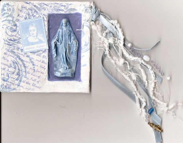
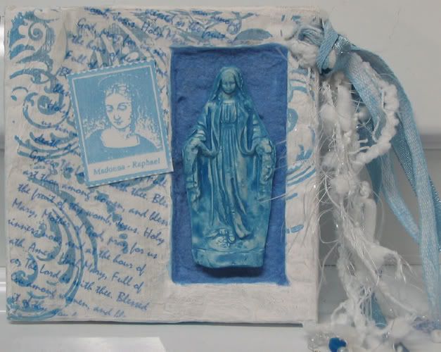
the page itself is about 1/4" thick, it's made of two layers of corrugated cardboard and a piece of a ritz box. i cut the niches out of the cardboard layers and glued all the pages together, then used gel medium to coat them in white tissue paper. i wanted the edges to be solid too, so i covered them in the tissue as well. i painted it all white, except for the niche, i painted blue. i really like how the paint reacted to the tissue paper texture, it almost looks rubbed off in places, like a whitewashed wall. i stamped it with blue pigment ink, and printed out "hail mary" repeatedly on acetate and attached it. the mary statue is polyclay, i made a mold out of one of my little statues in my bathroom (using polyclay), then carefully reproduced it. it's only 1/2 as thick as the original statuette, so it fits into the niche nicely. it was white polyclay, then i did a wash with the blue paint. the niche itself is flocked.
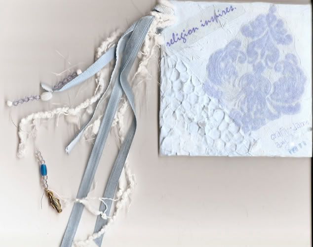
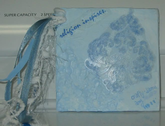
the back is painted with blue and white paint blended overtop more white tissue. i used some gel medium in the corner, with some of the holey material whose name i can never remember... i printed the title on acetate and attached it, and stamped the design on acetate with white StazOn ink, then stamped it again with the glue pad, and added flocking. the flocking didn't stick as well as i wanted, so i tried to redo it after it was already on, but the page isnt' completely flat, so the glue didn't xompletely cover it. i think it looks better than it did though. i'm a little peeved about my name in the corner - i went out and bought a light blue sharpie specifically to sign this page, and then it didn't work! damn.
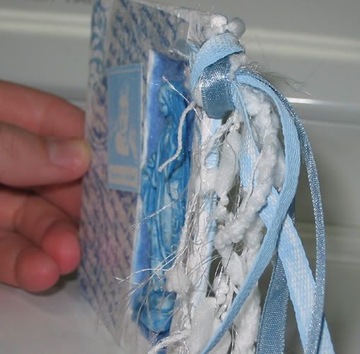
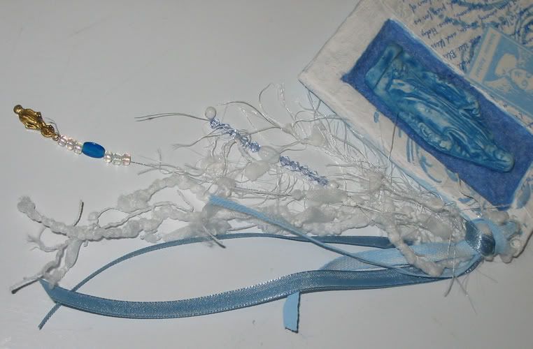
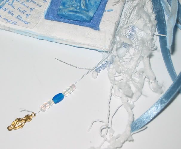
and the fibers are a mix of white fibers, blue ribbon, some twill tape i painted blue, and a silver embroidery floss strand with beads on each end. one end has clear blue beads with the teensy white mary bead i used on alteredmommy's tip in page, and the other has clear and blue glass beads with a small copper mary on the end.
and because i'm so obsessive, i took a bunch of pictures too, i didn't think the scan showed the details well enough. blogspot is cutting them off, but if you click them, you can see the full image.
and i just realized i never posted the first 4x4 page i made...
again, the scan doesn't do it justice...
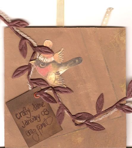
it's corrugated cardboard, with some of the lines showing where i tore the front off. i painted it with a mix of brown shades, with some gold paint mixed in as well. then i took a piece of pattern tissue paper, stamped it a bunch of times in different shades of brown, copper and gold, and glued it onto the cardboard. i painted over it again, so that the stamping barely shows through. the birdies are from a children's book, i scanned them and resized them and printed them and cut them out. i wrote the words on brown cardstock, and inked around the edges, put grommets on them, and threaded them onto ribbon and yarn. glued them down, then made the nest and glued that down too. the nest is organza ribbon, satin ribbon, light brown wool, and this cool brown satin trim that looks like leaves. i smushed it a bit to scan it, it's really 3-D in real life.
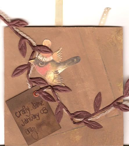
brown paisely patterned scrapbooking paper glued to brown cardstock (cause the cardboard needed a bit more support, and the scrapbooking paper wasn't enough). then i glued more of the pattern tissue on, and brushed it with more paint. wrote my info on a piece of brown cardstock, inked the edges, grommeted it, and threaded it on pieces of the brown wool and the cool trim, and glued it down. printed the bird bigger, and glued it on. i wanted it to look like the birds were holding the ribbon and stuff. the general theme for these pages is creativity, and my partner really likes birds.
and again, more pictures.... you can see how sparkly it is better in the pics.
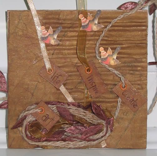
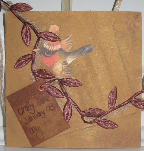
i don't know if they're that much better, but the whole page has a little bit of a metallic sheen from the gold paint i mixed in, and all the inked edges have gold pigment ink as well as the brown. sparkly!
i'm really enjoying the 4x4 size, and since i always have to restrain myself from adding too many 3D elements, i love the chunky part too!

No comments:
Post a Comment