aren't they fun?
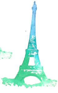
with the eiffel tower, you can see how the colours fade from top to bottom. i used 4 different shades, starting with a deep blue, a teal, an emerald green, and then a brighter green at the very bottom. this stamp is a rubber stamp, and is usually much more detailed, the technique lost a lot of it.
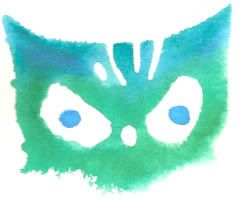
i did the same with the owl, though i think i only used 3 shades. this stamp is a hard foam stamp, one of the martha stewart collection halloween ones.
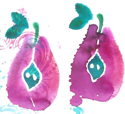
the pear is a foam stamp as well, and i used two shades of pink and two shades of green/teal on it. the stamp on the right had too much water, you can see how it lost the shape of the pear where it pooled before it dried.
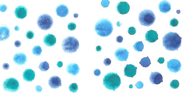
these polkadots are a foam stamp as well, and the "water drops" feel they give is perfect for this technique. there were three different shades of blue used. the group on the right had more water, you can tell by the shape of the dots.
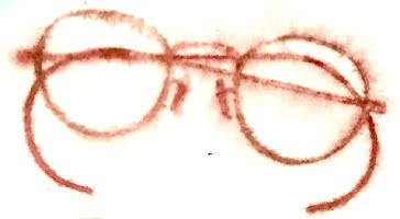
this one was done a little differently. the glasses are a rubber stamp, which i coloured with two shades of brown markers, then stamped onto paper that was already damp. you can see how the lines bled into the paper more this way. after i'd stamped it, i spritzed the paper again, which made the upper part of the glasses fade even more.
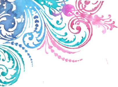
this is one of my favourite stamps, and i use it often (most recently, i used it on the documentary tip in page) instead of blending the colours with this one, i used different colours on the swirls, and just blended them slightly at the joins.
after playing around with these for a while on regular cardstock, i hauled out these coasters i bought at ruby dog's last week. they're plain on one side, and have small simple stripes on the other, so there really isn't much of an image to distract from what you add, and i quite like them. i was curious to see how the technique would stamp on something like a coaster, that's actually designed to be absorbant.
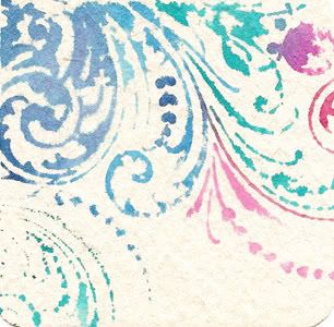
if you compare this image to the one done on the cardstock, you can see that it is a lot more choppy around the edges, and you lose a bit of the detail of the shading, but i still quite like the effect.
i tried the pear out on a coaster as well.
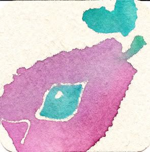
i was so enamoured with the results of the coasters that i stopped in at ruby dog's on saturday and bought more.... i have plans to make a little book out of them, but we'll see if that ever materializes!

No comments:
Post a Comment