annyway, issue 5 was released last week, and since i was procrastinating on my taxes, i decided that it was the perfect time to try out one of the patterns in it! this issue is focusing on pre-cuts, which are arguably one of the biggest changes in the quilting industry in recent years.
my favourite pre-cuts are definitely charm packs. i buy them to see if i like a line before i buy yardage, and they're fun to work with on smaller projects. i don't usually buy jelly rolls or fat quarters, because they're a bit too pricey for me if i don't know if i'll like the entire line or not. i'm tempted to buy layer cakes, and i'm starting to think that they'd be fun to work with, but again, it boils down to getting pieces of all of the prints, even ones i don't like, or buying getting yardage of my favourites.
one of the projects in issue 5 was specifically designed for charm packs, which made me very excited! all too often patterns that use charm packs ALSO require a jelly roll or a layer cake, which isn't helpful if you only have a charm pack.
the Bookworm pattern made me happy, being a project just for charm packs. and i adore using library cards in mixed media, so i liked the inspiration for it as well.
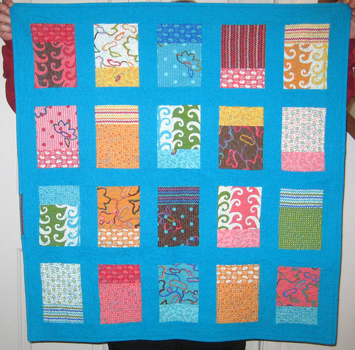
i went digging through my charm packs, and found a partial pack of Modern Workshop by Oliver and S for Moda. i'd already used some of my favourites for a different project, which left me with about 30 charms.
if you look at the full shot of the quilt in the e-zine or in the blog post that i linked to above, you'll notice that the smaller rectangles in each block appear to be prints. they're actually solids, but when the full quilt was photographed, the sun shining through made the print of the backing fabric show up. i can't tell you how many times i compared the photos, sure i was imagining things!
anyway, the pattern calls for solids, but i really liked the way the quilt looked with prints, so i decided to use prints for both parts of the block. that meant i could only make 20 blocks with the charms i had, so i made a small baby quilt. it ended up being a quarter of the full sized quilt, which uses 40 charms.

because it was going to be a smaller quilt, i made my sashing a bit wider than the pattern calls for - i'm apparently incapable of following a pattern exactly! i used a blue linen for my sashing. it wasn't the same linen as my paperpieced bunting pillow, but the colour is pretty darn close!
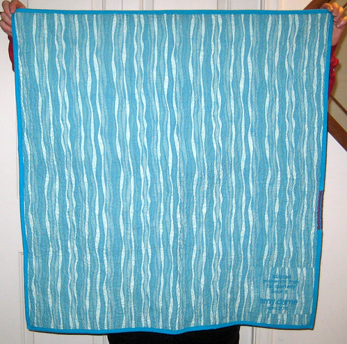
i backed the quilt with one full piece of fabric, because it was so small. i nabbed yards of this fabric in 3 different colourways a while ago, specifically with backing in mind. i was really tempted to order some yardage of Modern Workshop for the backing and binding, but i'm trying to work from my stash, so i resisted. and i didn't want to have to wait to finish the quilt, i wanted to post it asap after the issue came out (and then it took me a week to blog about it - good going amy!)

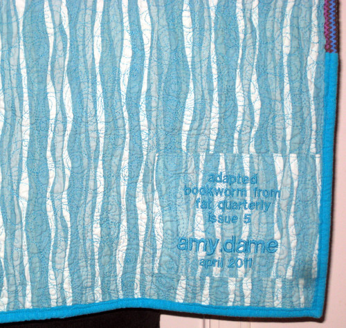
i used the same fabric for an embroidered label - the linen would have looked cool, but it had a fairly loose weave, and i didn't feel like fiddling with the embroidery machine to get it to look right. cotton was just that much easier, and this quilt came together so quickly that i was all about the easy.

i quilted the quilt with an all over swirls design, and it probably took longer than the construction - once i start free motion quilting, i'm incapable of not quilting the crap out of a project! i definitely need to practice with leaving space around my quilting.
so there's my version of Bookworm. what do you think? do you like it? honestly, i don't, not really!
i like the pattern, i think it's really fun, but i don't really like the prints. i had mixed feelings about the Modern Workshop line. i LOVED a few of the prints, but the colours of the rest were so not me, with the browns and oranges. it was the odd multicoloured flowers i think - i loved the print with stripes and polka dots, but i wasn't too fond of the flowers on top of them. hmm. i'm sure other people loved it!

4 comments:
Wonderful! Your quilting looks amazing. I love the squiggles! I really like the blue sashing. Brings it all together.
Sorry that you found our Modern Madness competition confusing (we'll try better next year!), but I'm so glad that you read & enjoy Fat Quarterly! I know you're not crazy about the final result of your mini quilt, but I LOVE it. Nice job!
thanks always! my quilting isn't too bad actually, my tension is usually okay and my stitch size is fairly consistent, i just need to learn to spread it out a bit more! i like the blue as well - i auditioned 5 or 6 options in photoshop before i decided.
john, the modern madness thing was too much mathy-left-brained thinking for me! i think it's just something that people grow up doing, and therefore understand, if that makes sense. i didn't grow up in a sports oriented family (the only sport we watch regularly is curling! we're so canadian.), so it's completely foreign to me. i think it's an american thing. like tailgating. i don't really get that either! of course it's way too cold for tailgating during hockey season....
i'm glad you like the quilt though, it's kind of growing on me!
hi amy, it's a gorgeous quilt, i love your color combos, it was wonderful to see it in person at the guild mtg last night! Loved your little cushion too! xo
Post a Comment