
over on craftster, kittykill announced the october needlework challenge, the Good Cause Challenge. i immediately decided to make a piece or two, and this is the first one. i've been waiting not so patiently for the 18th, thinking that entries could be posted then, only to realize today that i COULD have posted this back on the 12th! thank goodness i checked tonight, because today was the last day to enter!
my original plan for this piece was an anatomical image of a breast with a lump, much like the pregnancy anatomical image i embroidered a few months ago. breasts are incredibly complex, and i love all the lines that make up the images.
i started googling for images, and ran across an entirely different anatomical image - the breast cancer cells themselves. though i continued searching for the breast images, i kept coming back to the cells. they were so BEAUTIFUL, and i was really challenged by the idea of a more 3-D needlework piece, since i usually work on flat surfaces of fabric.
i started thinking about how as a society we idealize beautiful breasts, regardless of what may be hidden inside them. a pair of slightly droopy mom of 3 breasts are seen as less beautiful and less valued than a pair of young perky 20 year old breasts, regardless of actual health. you usually can't tell from the surface if someone has breast cancer, which is why self exams are so important.
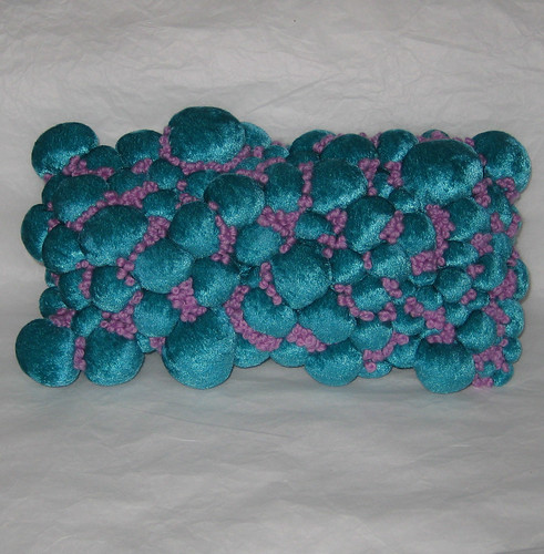
and this is what i came up with.
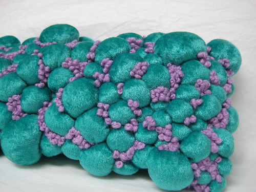
this ended up being smaller than i'd originally planned, because gathering up the bobbles took WAY more fabric than i'd anticipated! i bought half a metre of fabric, about 19", and the piece ended up being 5.5" tall and 10" or 11" wide. i used a stretch velvet because i wanted that slight sheen, the variance in tone dependent on light, that velvet has. i used sewing thread to hand stitch circles on the fabric, then pulled them up tight and stuffed them with fiberfill. i didn't have any fiberfill, but i did have a pillow form - this piece took almost all of a 12"x12" pillowform's stuffing! it took a really really long time, so much longer than i'd anticipated!
after i had all the cells complete, i hand basted the velvet onto a piece of cotton, basting between the cells to keep the surface consistent (the cells had a tendency to pop out everywhere!).
i used dmc tapestry wool, colour 7896, for the french knots. i printed out the image and took it with me when i went shopping, and this was the closest i could get between dmc and anchor. i looked at embroidery floss, and at the possibility of using beads instead of the french knots. the embroidery floss was too shiny, and would have made knots that were smaller in proportion to the cells than i wanted, and the same thing went for the beads.
because i was using wool, but working with a fabric that i would need to pierce, i used chenille needles that were thick enough to thread the wool onto, but sharp enough to pierce the fabric (unlike typical needlepoint needles).
i find french knots easy (don't throw stuff at me! i'm sorry!! ;D), so that part of it was fine, but getting the wool through the "cells" was a whole different story! after an evening that left me with severely bruised and callused fingers, i dug out my locking pliers and used them to get the needle through. in some areas it was going through countless layers of fabric and fiberfill, the gathering of the bubbles/cells created a lot of excess fabric around the bases of them!
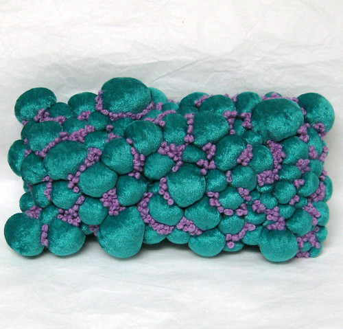
with the flash, the colour is a little less accurate. it looks more blue here than green.
and the back, with the title stem stitched across.
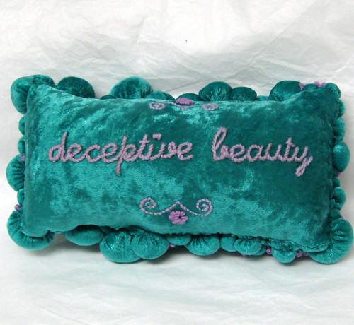
i had bought all the skiens of tapestry wool that my local needlework shop had, and used the majority of them for the front. i decided to use a lighter shade for the words, so that i could do as many french knots on the front as possible!
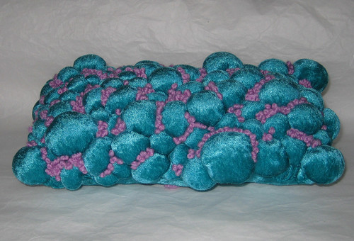
i also did a little flower design, to tie the two purple shades together and to add detail to the upper and lower portions. i used french knots there as well, and back stitch for the curlicues.

i'd like to do more french knots on the sides, the areas that aren't visible from the front, once my local needlework shop gets in more wool of this colour.
after both sides were done, i machine stitched the two long sides of the pillow. i had to use my sister's industrial machine, mine refused to stitch it! i stuffed the pillow, and ended up hand stitching the short ends because it was impossible to get the sewing machine foot close enough to the bubbles/cells.
and this is the image that inspired it all -
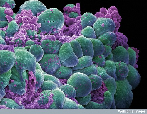
Credit: Annie Cavanagh. Wellcome Images
images@wellcome.ac.uk
images.wellcome.ac.uk
A cluster of breast cancer cells showing visual evidence of programmed cell death (apoptosis).
Scanning electron micrograph
definitely go check out the other entries in the challenge too! i haven't had a chance to comment on them yet, but they're all wonderful! voting starts tomorrow, and goes until october 25th.
21 comments:
wow...very imaginative and creative...It is beautiful and scary at the same time...great work...good luck with the contest =)
YOU ROCK MY SOCKS OFF! This is so amazing, and so beautifully executed. I LOVE IT! All my self exams, feel like it would look like your creation- and I am so happy to see a pic of your inspiration, it is so amazing, you are amazing! You got my vote!
You are so incredibly talented. This is amazing. Excellent work.
Very fine work.
I am thinking that now, after Cleveland Cavaliers superstar LeBron James' cancer scare, I believe that there will be increasing awareness on all forms of cancer.
Great craft idea, but man oh man, it hurts my eyes to read this much improperly-capitalized text! I know you can find your shift key, 'cause you typed "WAY" in all caps and used a :D smiley, so WTF? Are you just too cool to use proper capitalization or something? Seriously, it's incredibly irritating. The word "I" in lowercase is the worst, I think. In my head it sounds like a short i sound (as in the word "sit").
thank you so much everyone. i honestly can't stop obsessing over this piece, i'm so happy with how it turned out, and i finally feel like i've made something more in the art vein, which i've been craving to do for so long now.
anonymous, i'm sorry it irritates your eyes. i think we all have things that bother us on the internet, such a blogs written in coloured font on coloured backgrounds, or excessive lol speak. i simply don't like capitals. with proper punctuation there's no need for them, the period indicates the end of a sentence. i don't like the shapes of most capital letters, and i don't use them unless i specifically have to. i especially like the lower case i, because uppercase i often looks like a lower case l! it has nothing to do with "being cool", this is simply the way i have typed and written for almost 20 years now.
Beautiful work, Amy. Very powerful. I love seeing your art.
Amy this is Arli...I linked in via Andi's LJ. That is an amazing piece of work, really powerful.
First of all, this is incredible. I was intrigued and then totally blown away when I saw the inspiration. Going more 3D was brilliant!
I imagine that everytime you look at it you tell yourself that you're a fucking rockstar/genius. Which, as we all know, is 7 levels more impressive then a regular rockstar/genius. :-)
Second, its pretty funny, I've been following your blog for awhile now and never noticed the capitalization. Fortunately, my eyes don't easily offend. ;-) Keep up the good work!
I find this piece to be in poor taste and to be pointless. Deceptively beautiful, deceptively crass
tricia and arli, thank you so much! especially tricia, since i'm continually in awe of your knitting skills! i'm so glad you can see and appreciate the power of the piece.
virg, thank you! i have to admit that i have been thinking rockstar thoughts every time i look at it! it was a difficult project, and i'm so happy that it turned out the way i envisioned it in my head! my little brother told me that he would be offended by my lack of capitalization too, but frankly i think he was just saying that to be a jerk!
anonymous, i'm not sure why some people are having problems with it (here and on craftzine's facebook page). the point of the challenge was breast cancer awareness, and i think the piece is doing that. it surprises people, making them think about what the cells in their bodies look like, and draws attention to our society's view of beauty, which is quite often despite the invisible aspects which are not beautiful at all in reality.
Wow, that is awesome! As a breast cancer survivor I would love to have it. Well done!
Hi Amy,
I love this thought-provoking piece so much that I profiled it on my blog Craft & Creative. :) Great work!
http://www.lisaashby.com/craftandcreative/2009/10/deceptive-beauty/
Lisa
Hey Amy, Just read on Mr X stitch that this most beautiful piece has won the competition.
Very very very well done. My Anatomy of motherhood is looking down at me as I write.
This piece is beautiful, thought provoking ( obviously) and challenging in all the right ways.
YOU ROCK!
I am off to read your blog again to check the capitals... had never noticed!
hugs
Jo
Congratulations on winning! I'm not surprised, given how stunning your piece is. Hooray for you! :)
AMAZING work! You really got that pillow bang on. Wonderfully creativity. Man, I wish I could do stuff like this. It's truly an art.
I'm so impressed. It looks really complicated and really beautiful. I actually saw this on the Internet... somewhere... earlier this week with your name on it. I was like "I've been to her blog before!"
Good work.
My son sent me the link to your blog, mostly because I work for Breast Surgeons. Your work helps to find anything positive in a frightening, horrible experience. I have seen all sizes and shapes of breasts which in the end are "just tissue" when it comes to saving a womans life. I'm thinking that visualizing inner beauty would be a great help in fighting the cancer...you did a great job!
Wow, love. This is amazing! I was going through my ritual of reading neatorama.com and I saw this linked! It had a picture of the piece, and said "...from flitter, vinyl, and thread" and I thought OHWOWIKNOWYOU.
Anyway, this is gorgeous and powerful. I absolutely adore it.
....just happened upon you - go check out polyps! My mum had some and hers were the most beautiful pink! I was blown away with them!
Amazing work! I love the colours, and you've done a fantastic job of recreating the image from the electron microscope.
I think it will definitely raise awareness because it's beautiful and thought-provoking.
Best wishes
Joey x
Post a Comment